
TSDN Customer Segmentation
Project Overview
Background
In October 2022, I Joined a data science competition named Turnamen Sains Data 2022. Turnamen Sains Data 2022 is a national-scale competition aimed at Data Science Activists, Data Enthusiasts, or Technology Activists (AI and Machine Learning). In this competition, our goal is to create a data science project that pushes innovation to solve problems. My project is about Customer Segmentation the project is motivated by the need to understand the customers to create marketing strategies that are personalized to the customer’s background such as income, customer behavior, age, and gender. Although I’m not winning the competition I learned a lot and gained so much experience.

The Dataset Information
The dataset is created for the learning purpose of the customer segmentation concepts, and is publicly available on Kaggle. The dataset is about mall customer data. Let’s say you are owning a supermarket mall and through membership cards, you have some basic data about your customers like Customer ID, age, gender, annual income, and spending score. A spending Score is something you assign to the customer based on your defined parameters like customer behavior and purchasing data.
The Objectives
- Create a model that can segment customers into multiple groups.
- Create visual media in a form of a Powerpoint presentation
- Create narrative insights that can be obtained from this project.
Project Output
By leveraging customer segmentation, we can tailor various product aspects, including prices, features, and marketing strategies, to specific customer groups. This targeted approach ensures that our efforts are precisely aligned with their preferences, ultimately leading to a reduction in resource utilization compared to employing generalized marketing campaigns across all customer segments. The rationale behind this strategy lies in the fact that customers belonging to distinct segments tend to exhibit diverse reactions to marketing activities, making personalized approaches more effective and efficient.
The Code
Import Libraries
In this project, I use some of these Python libraries to help me achieve my goal they serve different purposes from data processing, visualization, and modeling.
# These are data processing libraries
import numpy as np
import pandas as pd
import scipy
#These are the visualization libraries. Matplotlib is standard and is what most people use.
#Seaborn works on top of matplotlib.
import matplotlib.pyplot as plt
import seaborn as sns
#For standardizing features. We'll use the StandardScaler module.
from sklearn.preprocessing import StandardScaler
#Hierarchical clustering with the Sci Py library. We'll use the dendrogram and linkage modules.
from scipy.cluster.hierarchy import dendrogram, linkage
#Sk learn is one of the most widely used libraries for machine learning. We'll use the k means and pca modules.
from sklearn.cluster import KMeans
from sklearn.decomposition import PCA
# We need to save the models, which we'll use in the next section. We'll use pickle for that.
import pickle
Data Understanding
# Load the data, contained in the segmentation data csv file.
df_segmentation = pd.read_csv('data/Mall_Customers.csv', index_col = 0)
df_segmentation.head()
Using Python library like Pandas we can read the data and look at the first five rows of the dataset.
| CustomerID | Gender | Age | Annual Income (k$) | Spending Score (1-100) |
|---|---|---|---|---|
| 1 | Male | 19 | 15 | 39 |
| 2 | Male | 21 | 15 | 81 |
| 3 | Female | 20 | 16 | 6 |
| 4 | Female | 23 | 16 | 77 |
| 5 | Female | 31 | 17 | 40 |
Based on the provided table, it appears to be a dataset related to customer demographics and spending behavior. The dataset contains the following columns:
- CustomerID: An identifier for each customer, which seems to be a unique numeric value for each record.
- Gender: The gender of the customer, represented as either “Male” or “Female.”
- Age: The age of the customer, represented as a numeric value.
- Annual Income (k$): The annual income of the customer in thousands of dollars, represented as a numeric value.
- Spending Score (1-100): The spending score of the customer, which indicates their spending behavior and is represented as a numeric value ranging from 1 to 100. A higher score indicates a higher propensity to spend.
# We'll plot the correlations using a Heat Map. Heat Maps are a great way to visualize correlations using color coding.
# We use RdBu as a color scheme, but you can use viridis, Blues, YlGnBu or many others.
# We set the range from -1 to 1, as it is the range of the Pearson Correlation.
# Otherwise the function infers the boundaries from the input.
plt.figure(figsize = (12, 9))
s = sns.heatmap(df_segmentation.corr(),
               annot = True,
               cmap = 'RdBu',
               vmin = -1,
               vmax = 1)
s.set_yticklabels(s.get_yticklabels(), rotation = 0, fontsize = 12)
s.set_xticklabels(s.get_xticklabels(), rotation = 90, fontsize = 12)
plt.title('Correlation Heatmap')
plt.show()
This code generates a heatmap to visualize the correlations among features in the dataset, providing insights into the relationships between customer attributes such as age, gender, annual income, and spending score.
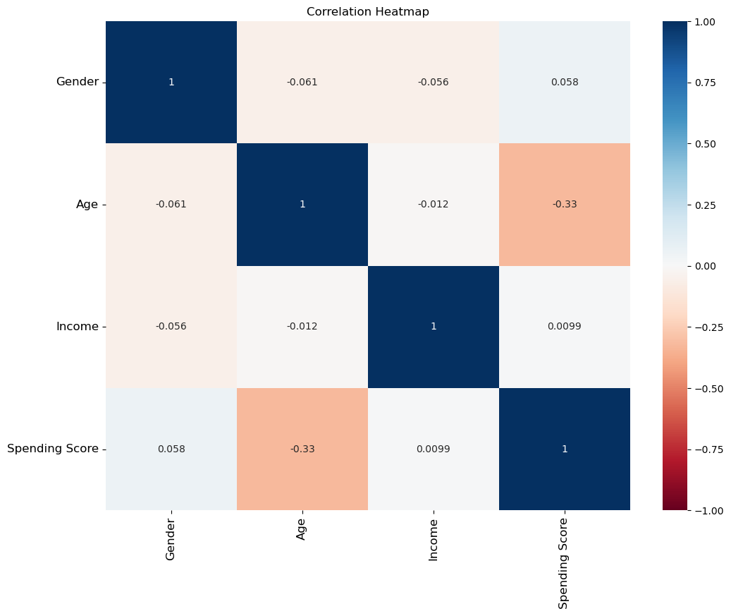
Based on the correlation heatmap, we can observe that there is no strong correlation among the features. The highest correlation coefficient is approximately -0.33, indicating a weak negative correlation between the customer’s age and spending score. This lack of strong correlations suggests that the customer attributes are relatively independent of each other, which might require more sophisticated techniques for customer segmentation in the project.
Scaling
scaler = StandardScaler()
segmentation_std = scaler.fit_transform(df_segmentation)
Standardizing data, so that all features have equal weight. This is important for modeling. Otherwise, in our case Spending Score would be considered much more important than Age for Instance. We do not know if this is the case, so we would not like to introduce it to our model. This is what is also referred to as bias.
Choosing the number of clusters
# Perform K-means clustering. We consider 1 to 10 clusters, so our for loop runs 10 iterations.
# In addition we run the algorithm at many different starting points - k means plus plus.
# And we set a random state for reproducibility.
wcss = []
for i in range(1,11):
    kmeans = KMeans(n_clusters = i, init = 'k-means++', random_state = 42)
    kmeans.fit(segmentation_std)
    wcss.append(kmeans.inertia_)
This code snippet involves the calculation of the Within-Cluster Sum of Squares (WCSS) for different values of ‘k’ in K-Means clustering. We loop through the range of values from 1 to 10 and for each ‘k’, we initialize a K-Means model with ‘k-means++’ initialization method. Then, we fit the model to the preprocessed data, and the resulting WCSS is stored in the ‘wcss’ list. WCSS represents the sum of squared distances of data points to their assigned cluster centroids, and it is useful for determining the optimal number of clusters for K-Means clustering.
# Plot the Within Cluster Sum of Squares for the different number of clusters.
# From this plot we choose the number of clusters.
# We look for a kink in the graphic, after which the descent of wcss isn't as pronounced.
plt.figure(figsize = (10,8))
plt.plot(range(1, 11), wcss, marker = 'o', linestyle = '--')
plt.xlabel('Number of Clusters')
plt.ylabel('WCSS')
plt.title('K-means Clustering')
plt.show()
In this section, we visualize the Within-Cluster Sum of Squares (WCSS) for different numbers of clusters using a line plot. By plotting the WCSS against the number of clusters, we can identify the optimal number of clusters for K-means clustering. We observe the plot for a ‘kink’ or elbow point, where the WCSS reduction becomes less pronounced, suggesting the appropriate number of clusters to be used in the K-means algorithm.
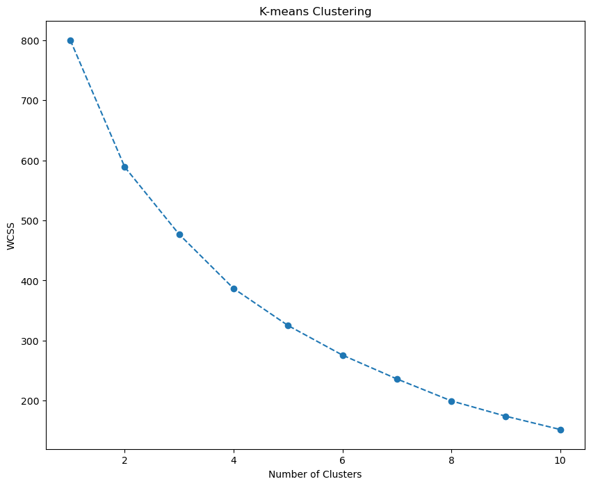
The elbow method is a heuristic technique used to determine the optimal number of clusters in a clustering algorithm. It involves plotting the variance explained by the clustering algorithm for different numbers of clusters and looking for the “elbow” point on the plot. The “elbow” is the point at which the variance starts to level off, forming a bend in the plot. In this case, it’s not very clear, but 4 or 5 seems ok. Let’s choose 4.
Clustering
kmeans = KMeans(n_clusters =4, init = 'k-means++', random_state = 42)
kmeans.fit(segmentation_std)
We apply the K-means clustering algorithm to the preprocessed data. The KMeans model is initialized with ‘k-means++’ method, and we set the number of clusters to 4. By fitting the model to the standardized data ‘segmentation_std’, K-means will assign each data point to one of the four clusters, based on their similarity to the cluster centroids. After this step, the data is effectively segmented into four clusters, which can be analyzed further for customer segmentation purposes.
df_segm_kmeans = df_segmentation.copy()
df_segm_kmeans['Segment K-means'] = kmeans.labels_
df_segm_kmeans.head()
We create a new DataFrame ‘df_segm_kmeans’ as a copy of the original ‘df_segmentation’. Next, we add a new column ‘Segment K-means’ to ‘df_segm_kmeans’, which holds the cluster labels assigned by the K-means clustering algorithm to each data point in the ‘segmentation_std’. The ‘head()’ function is then used to display the first few rows of the DataFrame, providing a glimpse of how the data is now augmented with the corresponding K-means cluster assignments.
| CustomerID | Gender | Age | Income | Spending Score | Segment K-means |
|---|---|---|---|---|---|
| 1 | 0 | 19 | 15 | 39 | 3 |
| 2 | 0 | 21 | 15 | 81 | 3 |
| 3 | 1 | 20 | 16 | 6 | 2 |
| 4 | 1 | 23 | 16 | 77 | 1 |
| 5 | 1 | 31 | 17 | 40 | 1 |
# Calculate mean values for the clusters
df_segm_analysis = df_segm_kmeans.groupby(['Segment K-means']).mean()
df_segm_analysis
We perform an analysis of the K-means clusters by calculating the mean values for each cluster. Using the ‘groupby’ function on ‘df_segm_kmeans’, we group the data by the ‘Segment K-means’ column, which represents the cluster labels assigned by K-means. Then, we compute the average values of all other columns within each cluster. The resulting ‘df_segm_analysis’ DataFrame presents the mean values for each feature across the different K-means clusters, offering insights into the characteristics of each customer segment.
| Segment K-means | Gender | Age | Income | Spending Score |
|---|---|---|---|---|
| 0 | 0.0 | 49.437500 | 62.416667 | 29.208333 |
| 1 | 1.0 | 28.438596 | 59.666667 | 67.684211 |
| 2 | 1.0 | 48.109091 | 58.818182 | 34.781818 |
| 3 | 0.0 | 28.250000 | 62.000000 | 71.675000 |
We further analyze the K-means clusters by computing the size and proportions of each cluster. Firstly, we use the ‘groupby’ function on ‘df_segm_kmeans’ to group the data by the ‘Segment K-means’ column, which represents the cluster labels assigned by K-means. Then, we calculate the number of observations (N Obs) in each cluster based on the ‘Gender’ column. Next, we compute the proportion of observations (Prop Obs) for each cluster by dividing the number of observations in each cluster by the total number of observations. The updated ‘df_segm_analysis’ DataFrame now includes the cluster sizes and their corresponding proportions, providing a deeper understanding of the distribution of data points across the K-means clusters.
| Segment K-means | Gender | Age | Income | Spending Score | N Obs | Prop Obs |
|---|---|---|---|---|---|---|
| 0 | 0.0 | 49.437500 | 62.416667 | 29.208333 | 48 | 0.240 |
| 1 | 1.0 | 28.438596 | 59.666667 | 67.684211 | 57 | 0.285 |
| 2 | 1.0 | 48.109091 | 58.818182 | 34.781818 | 55 | 0.275 |
| 3 | 0.0 | 28.250000 | 62.000000 | 71.675000 | 40 | 0.200 |
# Add the segment labels to our table
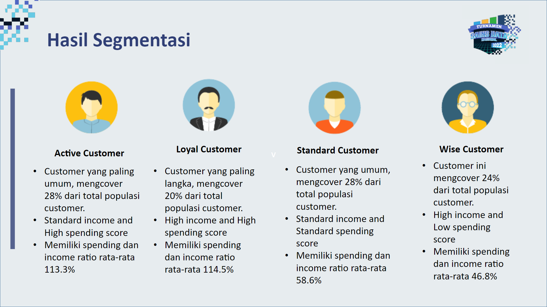
df_segm_kmeans['Labels'] = df_segm_kmeans['Segment K-means'].map({0:'wise customer',
1:'standard customer',
2:'rare customer',
3:'active customer'})
We enrich the ‘df_segm_kmeans’ DataFrame by adding a new column named ‘Labels’. The ‘Labels’ column is created based on the mapping of the ‘Segment K-means’ column to human-readable segment names. Each cluster label (0, 1, 2, 3) is mapped to a descriptive label: ‘wise customer’, ‘standard customer’, ‘rare customer’, or ‘active customer’, respectively. This step allows us to interpret and communicate the cluster results more intuitively, associating each customer segment with a meaningful label that represents their characteristics or behavior. Next, we plot the data.
While the segmentation provided valuable information the visualization wasn’t very clear particularly in the interpretation of the segmented area, which lacked clarity. To overcome this issue and further enhance my analysis, my next goal is to explore Principal Component Analysis (PCA). PCA is a powerful dimensionality reduction technique that can help me transform the data into a lower-dimensional space while retaining the most significant variation. By applying PCA, I aim to obtain a clearer representation of the data. This will enable me to visualize the clusters more effectively and gain deeper insights into the underlying patterns and customer behavior.
PCA
# Employ PCA to find a subset of components, which explain the variance in the data.
pca = PCA()
pca.fit(segmentation_std)
We have employed Principal Component Analysis (PCA) to discover a subset of components that efficiently capture the variance present in the standardized data ‘segmentation_std’. By fitting the PCA model to the data, we obtained a transformed representation where each component represents a linear combination of the original features. These components are ordered based on the amount of variance they explain, with the first component capturing the highest variance, followed by subsequent components. PCA is a crucial step in our quest for better visualization and understanding of customer segmentation, as it allows us to reduce the dimensionality of the data while retaining the essential information.
plt.figure(figsize = (12,9))
plt.plot(range(1,5), pca.explained_variance_ratio_.cumsum(), marker = 'o', linestyle = '--')
plt.title('Explained Variance by Components')
plt.xlabel('Number of Components')
plt.ylabel('Cumulative Explained Variance')
Plot the cumulative variance explained by total number of components.
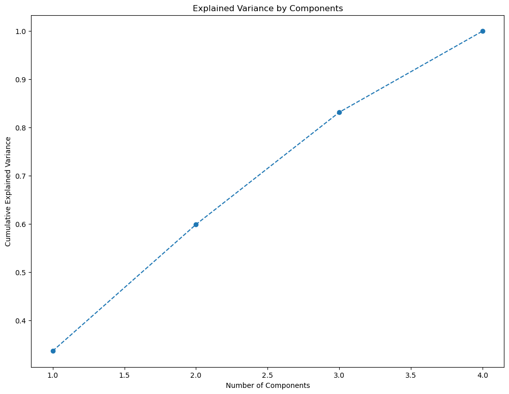
On this graph we choose the subset of components we want to keep. Generally, we want to keep around 80 % of the explained variance. We choose three components. 3 seems the right choice according to the previous graph.
pca = PCA(n_components = 3)
pca.fit(segmentation_std)
Fit the model the our data with the selected number of components. In our case three.
df_pca_comp = pd.DataFrame(data = pca.components_,
                           columns = df_segmentation.columns.values,
                           index = ['Component 1', 'Component 2', 'Component 3'])
df_pca_comp
| Gender | Age | Income | Spending Score | |
|---|---|---|---|---|
| Component 1 | -0.234302 | 0.687900 | -0.006082 | -0.686920 |
| Component 2 | -0.626886 | -0.103690 | 0.765252 | 0.103211 |
| Component 3 | 0.743009 | 0.122384 | 0.643667 | -0.136573 |
Clustering with PCA
We have chosen four clusters, so we run K-means with number of clusters equals four. Same initializer and random state as before.
kmeans_pca = KMeans(n_clusters = 4, init = 'k-means++', random_state = 42)
kmeans_pca.fit(scores_pca)
We utilize the K-means clustering algorithm once again, but this time on the transformed data obtained from Principal Component Analysis (PCA). We create a new KMeans model called ‘kmeans_pca’, specifying 4 clusters and using ‘k-means++’ initialization method for better convergence. Then, we fit the K-means model to the ‘scores_pca’, which contains the transformed data obtained through PCA. This allows us to perform clustering in a reduced feature space, enabling a more efficient and insightful customer segmentation based on the principal components.
# We calculate the means by segments.
df_segm_pca_kmeans_freq = df_segm_pca_kmeans.groupby(['Segment K-means PCA']).mean()
df_segm_pca_kmeans_freq
We continue the analysis by computing the mean values for each segment resulting from the K-means clustering applied to the data transformed using Principal Component Analysis (PCA). To achieve this, we group the ‘df_segm_pca_kmeans’ DataFrame by the ‘Segment K-means PCA’ column, representing the cluster labels obtained from the PCA-based K-means. Then, we calculate the average values of each feature within each segment. The resulting ‘df_segm_pca_kmeans_freq’ DataFrame provides valuable insights into the characteristics of each customer segment in the reduced feature space, helping us understand the distinct traits and behaviors of the identified customer groups.
| Segment K-means PCA | Gender | Age | Income | Spending Score | Component 1 | Component 2 | Component 3 |
|---|---|---|---|---|---|---|---|
| 0 | 0.0 | 49.437500 | 62.416667 | 29.208333 | 1.346375 | 0.598558 | -0.588323 |
| 1 | 1.0 | 47.803571 | 58.071429 | 34.875000 | 0.643591 | -0.756396 | 0.757360 |
| 2 | 0.0 | 28.250000 | 62.000000 | 71.675000 | -0.831991 | 0.914209 | -1.009810 |
| 3 | 1.0 | 28.392857 | 60.428571 | 68.178571 | -1.203347 | -0.409660 | 0.468210 |
Upon analyzing the values in the table, we can observe several patterns:
- Gender Segmentation: There seems to be a clear gender-based segmentation, where Segment 0 and Segment 2 are associated with Gender 0 (possibly female), while Segment 1 and Segment 3 are associated with Gender 1 (possibly male).
- Age and Income: Segments 0 and 2 have higher average ages and incomes compared to Segments 1 and 3. This suggests that these two segments might represent an older and potentially more financially stable or higher-income group.
- Spending Score: Segments 1 and 3 have higher spending scores compared to Segments 0 and 2. This indicates that individuals in these segments tend to spend more on the products or services represented by the dataset.
These patterns are preliminary observations. To gain more meaningful insights, further analysis and interpretation of the dataset and the specific use case are required. Additionally, visualization techniques can be employed to better understand the relationships between the different segments and features in the data.
# Calculate the size of each cluster and its proportion to the entire data set.
df_segm_pca_kmeans_freq['N Obs'] = df_segm_pca_kmeans[['Segment K-means PCA','Gender']].groupby(['Segment K-means PCA']).count()
df_segm_pca_kmeans_freq['Prop Obs'] = df_segm_pca_kmeans_freq['N Obs'] / df_segm_pca_kmeans_freq['N Obs'].sum()
df_segm_pca_kmeans_freq = df_segm_pca_kmeans_freq.rename({0:'wise customer',
                                                                  1:'standard customer',
                                                                  2:'rare customer',
                                                                  3:'active customer'})
df_segm_pca_kmeans_freq
We proceed with the analysis of the PCA-based K-means clustering results. By calculating the size of each cluster and its proportion to the entire data set, we gain a clearer understanding of the distribution of data points across the identified customer segments. Using the ‘groupby’ function on ‘df_segm_pca_kmeans’, we group the data by the ‘Segment K-means PCA’ column, representing the cluster labels from PCA-based K-means. Next, we count the number of observations (N Obs) in each cluster based on the ‘Gender’ column. We then compute the proportion of observations (Prop Obs) for each segment by dividing the number of observations in each cluster by the total number of observations. Finally, we rename the cluster labels with descriptive names, ‘wise customer’, ‘standard customer’, ‘rare customer’, and ‘active customer’, to facilitate clearer interpretation.
| Segment K-means PCA | Gender | Age | Income | Spending Score | Component 1 | Component 2 | Component 3 | N Obs | Prop Obs |
|---|---|---|---|---|---|---|---|---|---|
| wise customer | 0.0 | 49.437500 | 62.416667 | 29.208333 | 1.346375 | 0.598558 | -0.588323 | 48 | 0.24 |
| standard customer | 1.0 | 47.803571 | 58.071429 | 34.875000 | 0.643591 | -0.756396 | 0.757360 | 56 | 0.28 |
| rare customer | 0.0 | 28.250000 | 62.000000 | 71.675000 | -0.831991 | 0.914209 | -1.009810 | 40 | 0.20 |
| active customer | 1.0 | 28.392857 | 60.428571 | 68.178571 | -1.203347 | -0.409660 | 0.468210 | 56 | 0.28 |
- Segment K-means PCA: This column now has descriptive names for each segment, indicating the cluster’s characteristics or behavior. The segments are named “wise customer,” “standard customer,” “rare customer,” and “active customer.”
- N Obs and Prop Obs: These columns provide information about the number of observations in each segment and the proportion of the dataset they represent. For instance, “wise customer” segment has 48 observations, accounting for 24% of the dataset, while “standard customer” and “active customer” segments each have 56 observations, representing 28% of the dataset. The “rare customer” segment has 40 observations, accounting for 20% of the dataset.
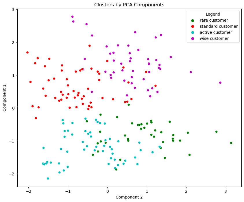
# Plot data by PCA components. The Y axis is the first component, X axis is the second.
x_axis = df_segm_pca_kmeans['Component 2']
y_axis = df_segm_pca_kmeans['Component 1']
plt.figure(figsize = (10, 8))
sns.scatterplot(x=x_axis, y=y_axis, hue = df_segm_pca_kmeans['Legend'], palette = ['g', 'r', 'c', 'm', 'y'])
plt.title('Clusters by PCA Components')
plt.show()
Next, we plot the data points based on their PCA components, with the Y-axis representing the first component and the X-axis representing the second component. Each data point is colored according to its corresponding cluster label, allowing us to visually distinguish different customer segments. The ‘sns.scatterplot’ function from the Seaborn library is used to create the scatter plot, and a color palette is applied to differentiate the segments with green (‘g’), red (‘r’), cyan (‘c’), magenta (‘m’), and yellow (‘y’).
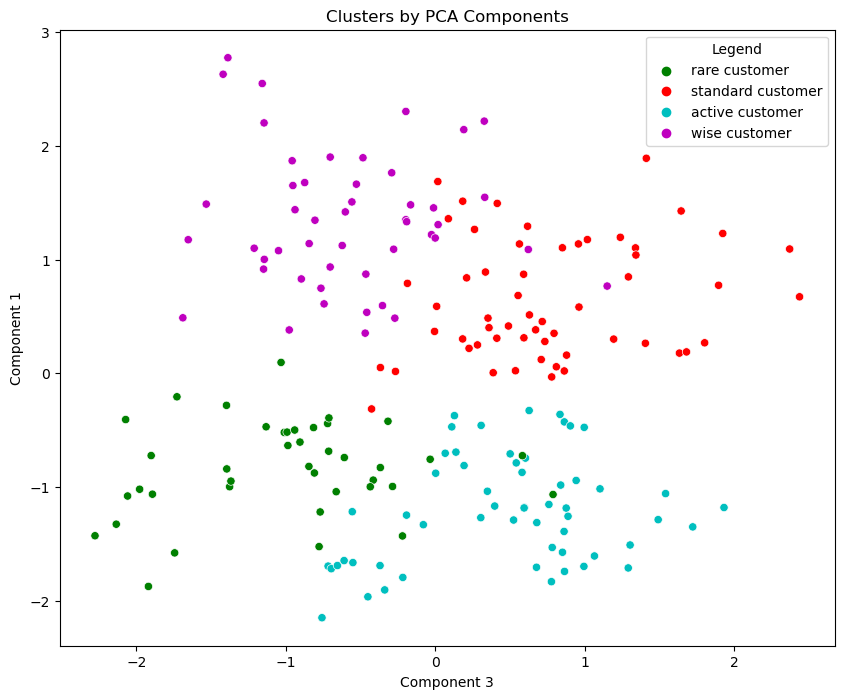
# Plot data by PCA components. The Y axis is the first component, X axis is the third.
x_axis_1 = df_segm_pca_kmeans['Component 3']
y_axis_1 = df_segm_pca_kmeans['Component 1']
plt.figure(figsize = (10, 8))
sns.scatterplot(x=x_axis_1, y=y_axis_1, hue = df_segm_pca_kmeans['Legend'], palette = ['g', 'r', 'c', 'm', 'y'])
plt.title('Clusters by PCA Components')
plt.show()
We continue the visualization of customer segmentation results using PCA-based K-means. This time, we plot the data points based on different PCA components. The Y-axis represents the first component, while the X-axis now displays the third component. Each data point is colored according to its corresponding cluster label, allowing us to visually distinguish different customer segments.
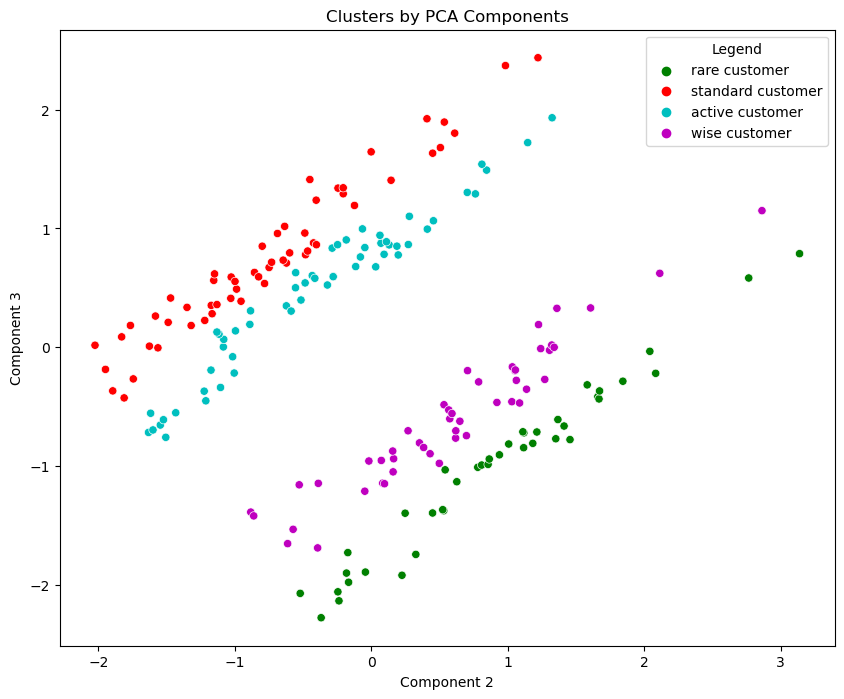
# Plot data by PCA components. The Y axis is the third component, X axis is the second.
x_axis_1 = df_segm_pca_kmeans['Component 2']
y_axis_1 = df_segm_pca_kmeans['Component 3']
plt.figure(figsize = (10, 8))
ax = sns.scatterplot(x=x_axis_1, y=y_axis_1, hue = df_segm_pca_kmeans['Legend'], palette = ['g', 'r', 'c', 'm', 'y'])
plt.title('Clusters by PCA Components')
plt.show()
We continue to visualize the customer segmentation results using PCA-based K-means. This time, we plot the data points based on different PCA components. The Y-axis represents the first component, while the X-axis now displays the third component.
These are just summaries of what I have done if you wanna take a look into more details you can access the full notebook on GitHub here.